When the Arlington Museum of Art prepares for a new exhibition, the planning process includes careful consideration of the entire exhibition space.
 As Kendall Quirk, AMA Director of Exhibitions & Registrar, began planning for the installation of A Knight’s Tale, she knew she wanted to create a certain mood as soon as visitors walked through the door. She accomplished this in part by choosing particular wall colors and textures—including royal blue velvet wallpaper on one wall and lush green velvet drapes on another—for each of the galleries in the exhibition.
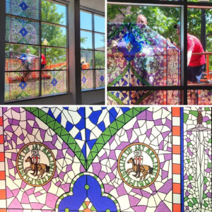
Especially stunning is the faux stained glass that stands nearly two stories high in the main Joyner Gallery. The colors of the piece complement the gallery walls and wield a subtle control of the light that casts through the panes of glass.
To create the piece, the museum commissioned graphic artist and illustrator Shelby Carson.
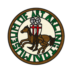
“Shelby did an amazing job marrying historically accurate references with modern aesthetics,” said Kendall, “and we love the whimsical nod to the Arlington Museum of Art that Shelby incorporated into the crest.”
![]()
Q&A with Shelby Carson
AMA: Tell us a little about your artistic background.
Shelby Carson: I have always been an artistic person. My dad is an architect, so I feel like art and design have always been ingrained in me from an early age. In high school, I considered different career paths, and after I took my first graphic design class in my junior year of high school, I was fairly certain that was my calling. From there, I kept chasing my passion for design and ended up at UT Arlington where I got a BFA in graphic design and a minor in art history. I always find myself drawn to the analytical and logical parts of graphic design and the more whimsical parts of traditional art and art history.
![]()
AMA: You’ve worked on several design projects for the Arlington Museum of Art. Can you tell us about one of your favorites?![]()

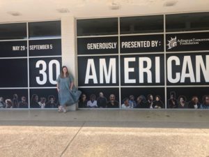
Shelby: I got my start with the Arlington Museum of Art by interning my senior year. My first semester of interning really helped me get the foundation of the museum and its inner workings, and what all went into an exhibit which was the perfect foundation for my second semester where I spent months designing the window design for 30 Americans. Part of me would say this project is my favorite because it was the first time that I, and even my family members, saw something of mine in the world and saw it contribute to a fantastic exhibit. The other part of me would tell you that being able to contribute to the graphic components of the entire exhibit, such as I did with A Knight’s Tale, would be my favorite because I was challenged in creating so many different designs with different intended purposes.
![]()
AMA: The Arlington Museum of Art commissioned you to create an original piece for their exhibit, A Knight’s Tale: a simulated stained glass window! That’s quite an undertaking. In what ways was this project similar to a logo design project and how was it different?
Shelby: Whereas logo designing for me is heavily vector-based and deals with more of the analytical parts of design, the stained glass window design was more illustrative in its creation. Both projects began with the ideation phases of researching and sketching, but to develop the final logo, I spent all my time in Adobe Illustrator whereas with the window I worked the majority of the time on Procreate on my iPad to create the final illustration.
![]()
AMA: Did the piece require research, and if so, what was that like?
Shelby: Lots of research went into the stained glass design because the museum staff and I truly wanted this piece to feel as authentic to the exhibit and time period as possible. We worked collaboratively to find examples of intricate stained glass designs that aligned with our vision, always coming back to Sainte Chapelle in Paris, France, and the fantastic stained glass windows there. In addition, understanding how the glass would form to make the shapes had this been a real stained glass window was integral to the design and its authenticity. I spent a lot of time watching stained glass tutorials on the internet to understand the process, while also examining high-resolution images of windows and their technical components to see real-life examples of what I wanted to illustrate.
![]()
AMA: What were some special challenges that you had to consider when designing the piece?
Shelby: The biggest challenge with this design in particular was creating one panel of stained glass that could be replicated to create the full stained glass window effect. I spent a lot of time lining things up and analyzing a lot of the details to make sure the end result window would look how we wanted. Another challenge was limiting how many colors we used to make sure the color didn’t overwhelm the museum’s interior. We wanted the stained glass to enhance the art and the exhibit’s experience, not overwhelm it and take away from it, so finding that perfect balance was a big component.
![]()
AMA: In what ways, if any, was the design process collaborative?
Shelby: When working as a designer, I think everything I make is collaborative in some way. In this case, I was not only working directly with the museum staff to ensure everything met their vision and standards, but I was also working collaboratively with the museum’s patrons in a way. At the end of the day, we wanted to make sure that AMA visitors would enjoy the stained glass window and other design components of the exhibit, so we worked collaboratively with the community and visitors as well.
![]()
AMA: How did it feel to see the piece installed for the first time?
Shelby: It is always a bit surreal seeing something you worked on being installed. It was especially surreal to see something that I worked on my 12×9″ iPad installed in such a large space. There’s a big sense of pride that I still get seeing people visit the exhibit and see something I made along with all the art.
![]()
AMA: When you’re a commissioned artist, you have to deal with the fact that your work doesn’t belong to you… it belongs to your client. In the case of this stained glass piece, your client will at some point take it down. As an artist, what is your takeaway from that part of the process?
Shelby: Every design serves a purpose in my mind. When it comes to this stained glass piece, its purpose was really to accent the exhibit and bring an additional bit of life to the building. At the conclusion of A Knight’s Tale, its purpose is fulfilled and I’m thrilled with the end result, so I can’t ask for much more from that.
![]()

